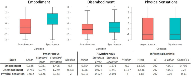
Figure 6.
Scale scores are depicted in the graphs and reported in the associated table in the lower part of the figure. The graphs are boxplots where the thick lines represent the medians, the boxes represent the interquartile ranges (25°–75°), and the whiskers represent minimum and maximum. The associated table reports the descriptive statistics for the synchronous and asynchronous conditions, and the paired samples t test results of the Synchronous Vs Asynchronous match. Cohen's dz was used to report the effect size.

