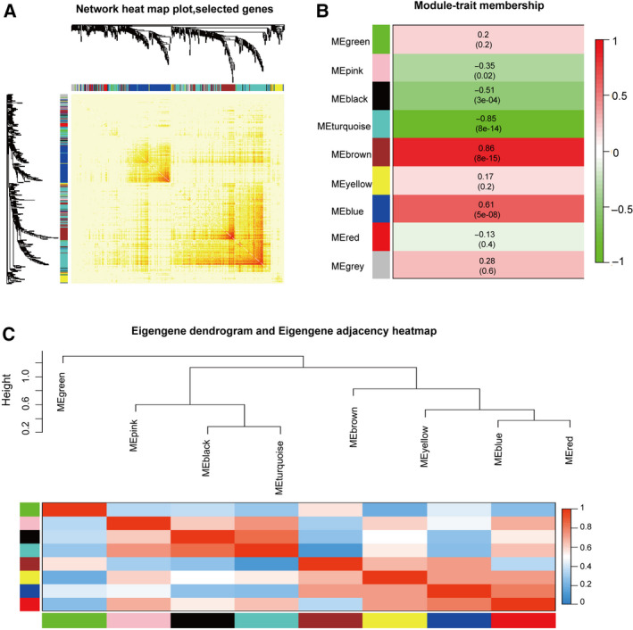
Fig. 3.

Identification of key modules. (A) Network heatmap plot of co‐expression genes. Different colours of the horizontal axis and the vertical axis represent different modules. The progressively saturated yellow and red colours indicate the high co‐expressed interrelation in the heatmap. (B) Heatmap of the correlation between module eigengenes and GBM. Each row represents a module eigengene and each column represents trait. The table is coloured by correlation according to the colour legend. The turquoise module is the most negatively correlated with GBM, and the brown module is the most positively correlated with GBM. (C) The hierarchical clustering dendrogram and the adjacency heatmap of each module. The top is the hierarchical clustering of the module crucial genes (labelled by colours). The bottom is the adjacency heatmap, where each column and row correspond to one module crucial gene (labelled by colour) or trait labelled by y. Red represents high adjacency (positive correlation), while blue colour represents low adjacency (negative correlation). Squares of red colour along the diagonal are the meta‐module.
