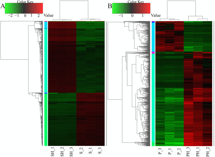
Fig. 2.
Heatmap of DEGs in P. polymyxa SC2 (a) and pepper (b).
Cluster analysis of expression patterns of genes/transcripts with significant differences was performed using a distance calculation algorithm. Spearman’s correlation coefficient was used to analyze the correlation among samples, while Pearson’s correlation coefficient was used for gene correlation analysis, and the cluster method was hcluster (complete algorithm). Each column in the figure represents a sample, and each row represents a gene. The color represents the gene expression in the group of samples (log10 FPKM); red indicates the gene is highly expressed in this sample, and green represents low expression. The number label under the colored bar at the top left of each panel presents the specific values for changes in gene expression. For each panel, the dendrogram of gene clustering is on the left, and the gene name is on the right. The closer the two gene branches are in the dendrogram, the closer their expression levels. The upper part of each heatmap depicts the dendrogram of sample clustering, while sample names are at the bottom of each heatmap. The closer the branches of two samples are in this dendrogram, the closer the expression patterns of all genes in these two samples. The original figures were shown in additional files (Additional File 5: Fig. S2, Additional File 6: Fig. S3)

