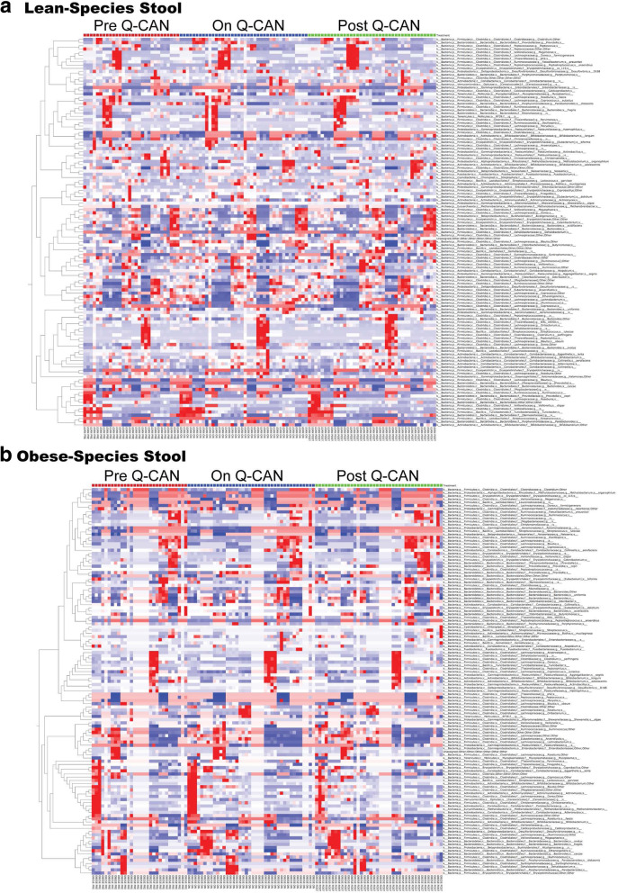
Fig. 5.
Intestinal microbiome analysis at the level of species. a-b Relative abundance of bacterial species is visualized by heat map. Each column represents a subject and each colored row a bacterial taxon. The intensity of the red color represents the highest abundance taxa and the intensity of the blue color the lowest abundance taxa in lean and obese people. The results are the average of 3 visits in pre Q-CAN® group, 4 visits in on Q-CAN® group and 4 visits in post Q-CAN® group for each participant. Obese (n = 9 participants), Lean (n = 10 participants)

