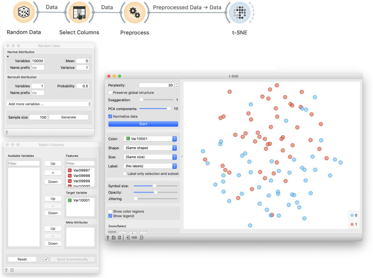
Fig 12. Colored t-SNE on random data.
Data preprocessed by feature selection is visualized in a t-SNE plot that separates the data instances of different class, denoted by blue and red color. Density of blue data points is higher in the top part of the visualisation, and green points are denser at the lower half of the plot. This separation of instances of different class is seemingly surprising as the class value assignment is random, and is a by-product of preprocessing and choosing of ten features that are, albeit arbitrarily, most correlated with the class variable.

