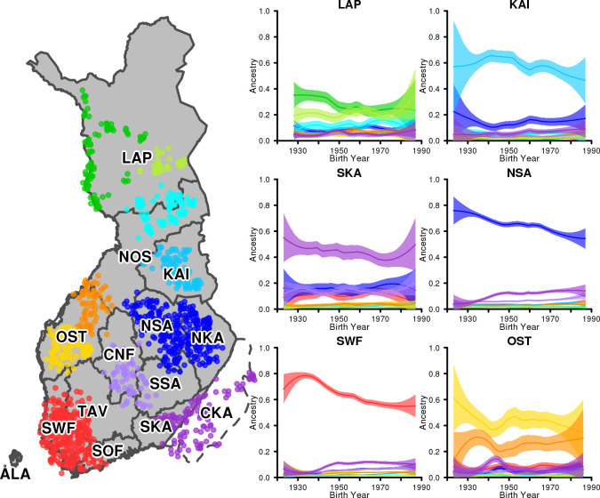
Fig 5. Development of genetic ancestry through the 20th century.
Map names 14 regions and shows the locations of the individuals who form the 10 reference groups. Each panel corresponds to one region and shows 10 curves corresponding to the 10 reference groups. Each curve shows the estimated proportion of ancestry from the reference group, as a function of birth years of individuals from 1923 to 1987. The bands around the curves show 95% confidence intervals.

