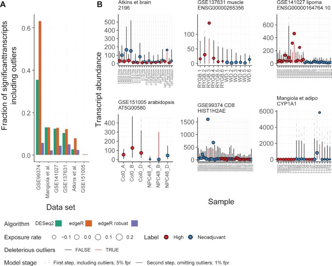
Figure 4.
Outlier detection on real-word data. (A) Bar plot representing the fraction of differentially transcribed genes (inferred by edgeR and DESeq2 according to recommendations (32,33)) that include outliers for six datasets collected from public repositories. (B) Visualization produced by ppcseq R package of the top differentially transcribed genes for each dataset, which included outliers. The colour coding represents the treatment regime, the error bars represent the credible interval of the theoretical data distribution, the size of the points is proportional to the inferred sequencing depth factor (exposure rate). The dashed error bars represent the 95% credible interval of the theoretical data distributions including outliers (first discovery stage), while the solid error bars represent the 99% credible interval (user defined parameter) data distribution excluding outliers, derived from truncated (at 95ft percentile) negative binomial distributions. The red error bars represent the outlier observations that do not fit the model.

