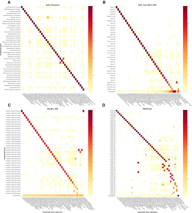
Figure 4.
Heatmaps representing the proportion of shared genes between the set of bins predicted by each selected binner and the set of expected species-level bins constituting the gold standard. Each row represents a predicted bin and the last row is dedicated to the genes unassigned by the binner. Each column represents an expected bin (41 species). Each squared dot is colored according to the following proportion: number of shared genes between a predicted bin (row) and an expected bin (species, column) divided by the total number of expected genes in the corresponding species. Rows and columns are sorted by decreasing proportion of shared genes. The panel (A) represents a heatmap of the gold standard results for which the set of expected species-level bins was compared with itself. The pair of predicted/expected bins identified by the diagonal line are indicative of the best mapping expected bin for each predicted bin. The heatmaps in panels (B–D) correspond to the results of the three selected best performing binner of each category: das tool, maxbin and mspminer.

