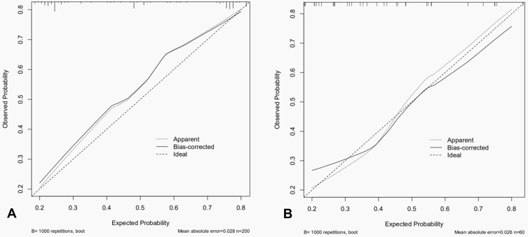
Figure 5.
The calibration curve of the nomogram for predicting malignancy. (A) Training cohort. (B) Validation cohort. The nomogram prediction of malignancy is plotted on the X-axis, and the actual observation is plotted on the Y-axis. Solid and dotted lines in calibration curves correspond to calibrating-predictive (bias-corrected) and predictive (apparent) values. Dashed lines correspond to standard (ideal) values.

