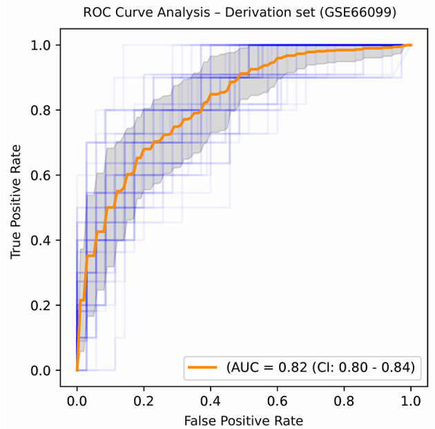
Figure 5.

ROC plot displaying the classification performances of the best model (in terms of mean AUROC) trained using the top 21 consistently chosen gene and clinical variables (Table 2) from patients included in the derivation dataset GSE66099 containing 228 samples. An ROC plot illustrates the performance of a binary classifier at different classification thresholds usually featuring a false positive rate (1-Specificity) on the x-axis and true positive rate (Sensitivity) on the y-axis. The top left corner is an ideal point with a false positive rate of zero and a true positive rate of one. The area under the curve (or AUC) denotes the probability that a randomly chosen positive instance is ranked higher than a randomly chosen negative one by our classifier. An AUC of zero means that the classifier is predicting the positive class as negative and vice versa, while an AUC of one denotes perfect separability. In the above figure, we denote the ROC plots generated from the different cross-validation experiments along with the mean area under the curve (in orange). The variance of the curve (shaded part) roughly shows how the output from our best performing model is affected by changes in the training data.
