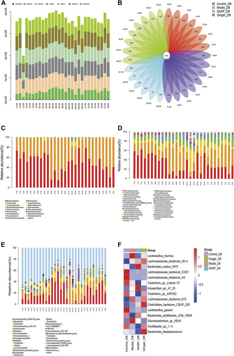
FIGURE 2.
Analysis of the microbial community structure of each group (A) Operational taxonomic unit (OTU) level bar plots. The X-axis shows the name of each sample, and the Y-axis is the total number of tags in OTUs under class. (B) Flower plot analysis of the number of OTUs in each sample. The values were obtained by subtracting representative sequences from OTU counts. OTUer ring indicates samples. Values on petals were the exact OTU numbers of each sample. The center of the circle represents sequences. (C) Relative abundance of phyla. Each column represents a sample. Different colors indicate different bacteria in phyla. The X-axis represents samples, and the Y-axis shows relative abundance in phyla. (D) Relative abundance of families. Each column represents a sample. Different colors indicate different bacteria in families. The X-axis represents samples, and the Y-axis is the relative abundance of families. (E) Relative abundance of genus. Each column represents a sample. Different colors indicate different bacteria in genus. The X-axis represents samples, and the Y-axis is the relative abundance of classes. (F) Heatmaps illustrate the relative abundance of families in samples, cluster tree on the left represents the clustering of families. The above-clustering branch group represents samples from different groups. Orange and blue indicate higher and lower relative abundance, respectively.

