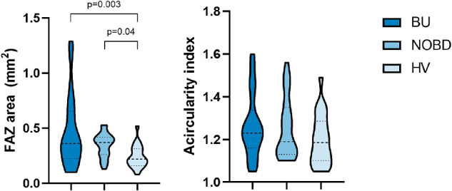
Figure 3.

The violin plot on the left shows the distribution of the FAZ area (mm2) of the three groups (BU, NOBD, and HV) in all of the vascular layers combined. The violin plot on the right shows the distribution of the acircularity index of the FAZ for each group. The dotted lines represent the median and quartiles.
