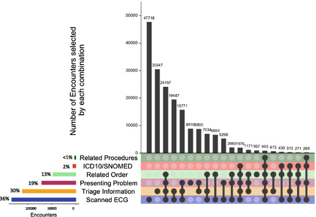
Fig. 3.
UpSet plot showing the number of encounters meeting individual (bottom left hand side) and multiple inclusion criteria (right-hand side). This UpSet plot represents 317,719 eligible encounters from Cerner information systems in two local health districts that met at least one of the study inclusion criteria in 2017. Inclusion criteria were described in Table 1. The histogram on the bottom left-hand side represents the total number and percentage of encounters that met each inclusion criterion. The plot on the top right-hand side represents the number and percentage of encounters that met each unique combination of inclusion criteria, depicted by the black circle(s) and lines. For example, the most frequent combinations were encounters that only had the presence of a scanned ECG image, followed by encounters that only had a keyword match in triage information

