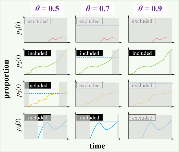
Fig. 2.
Illustration diagram of the analytical procedure of g-measure calculation. The prevalence time series of 4 different AA substitutions are denoted by p1(t), p2(t), p3(t) and p4(t), and indicated in red, green, orange and blue, respectively. Three scenarios of dominant prevalence threshold parameter, θ, are demonstrated with θ = 0.5, 0.7, and 0.9, respectively, which is indicated by the horizontal dashed line in each panel. The g-measure counts the segments of the prevalence series that start from 0 and increase over θ. In each panel, the prevalence series that accounts for g-measure is not shaded in grey region. In other words, the shaded regions are those part of prevalence series excluded from the g-measure calculation. For those prevalence series that never excess θ, they are excluded from g-measure calculation as labeled by ‘excluded’; otherwise, ‘included’ label is indicated

