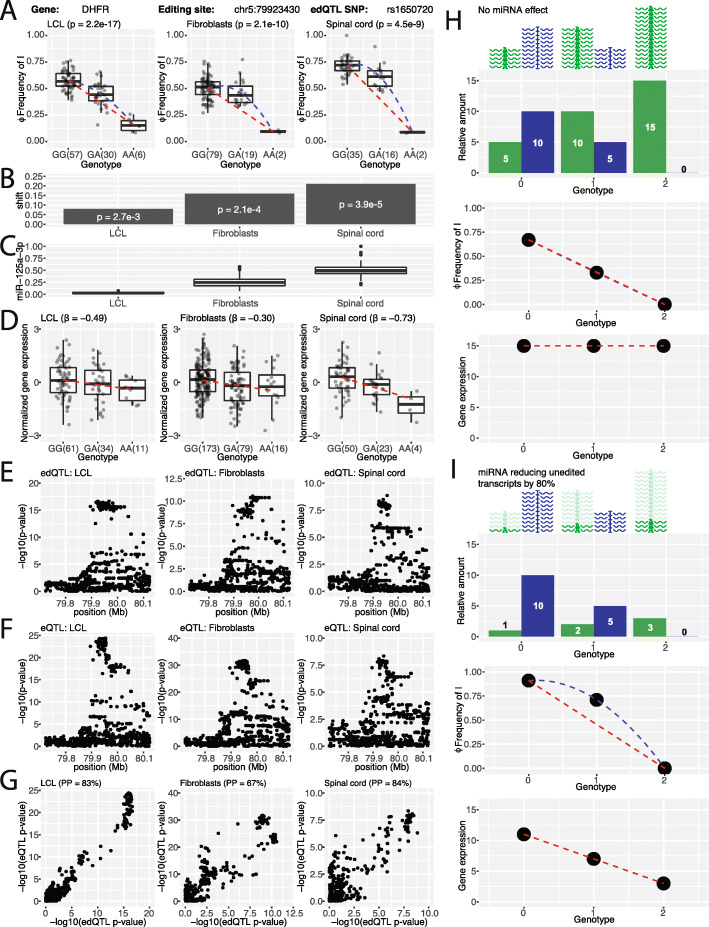
Fig. 4.
Steady-state transcript levels regulated by RNA editing and miRNA mediated transcript degradation. a edQTL signals in the DHFR gene for LCL, fibroblasts, and spinal cord. Box plots show the significant association of rs1650720 with the editing level (Φ) at chr5:79923430. Each dot represents data from a particular individual. edQTL p values are shown in parentheses. The dashed blue curve represents a quadratic fit of the data while the dashed red line represents a linear fit of the homozygous individuals. b Non-linearity of edQTL signals measured by the difference between the centers of the quadratic fit (dashed blue curve) and the linear fit using the homozygous individuals (dashed red line). c Box plots of the relative levels of miR-125a-3p inferred from RNA-seq data. d DHFR eQTL signal. Box plots show the significant association of rs1650720 with the normalized DHFR gene expression level. Each dot represents data from a particular individual. The dashed red line represents a linear fit of the data. e, f Manhattan plots showing the −log10(p value) for RNA editing edQTL (e) and gene expression eQTL (f) in a 400-kb window centered at the RNA editing site. g Scatter plot of −log10(p value) from edQTL and eQTL signals suggests colocalization of RNA editing variation and gene expression variation. Colocalization posterior probabilities are shown in parentheses. h, i Simulation of edQTL and eQTL signals with no miRNA effect on transcript degradation (h) and with an 80% miRNA effect on degradation of unedited transcripts (i). A schematic illustration and corresponding bar plot show the simulated levels of unedited (green) and edited (blue) transcripts across three genotypes (top). Simulated RNA editing levels and gene expression levels across three genotypes are plotted (bottom). In the edQTL plots, the dashed blue curve represents a quadratic fit of the data while the dashed red line represents a linear fit of the homozygous individuals. In the eQTL plots, the dashed red line represents a linear fit of the data

