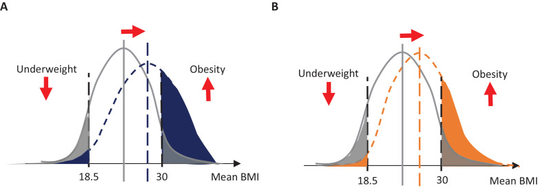
Figure 1. Schematic diagram of contribution of change in mean body mass index (BMI) to change in total prevalence of underweight or obesity.
(A) Change in the prevalence of underweight and obesity if the distribution shifts, represented by a change in its mean and its shape. In this example, the change (shown as the difference between blue and gray) results in a small decrease of underweight and a large increase in obesity. (B) Change in the prevalence of underweight and obesity when only mean BMI changes (shown as the difference between orange and gray), without a change in the shape of the distribution.

