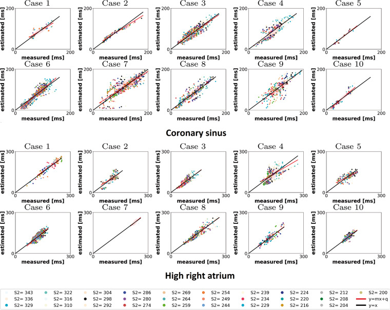
Figure 1.
Measured vs. estimated LAT for the personalized model. Top: CS; bottom: HRA. Each colour represents a different S2 value. Each point represents a measured vs. computed LAT at each electrode, fixed S2. The black line represents a perfect match of measured and estimated LAT. The red line is the best linear fit to the measured and estimated LAT. CS, coronary sinus; HRA, high right atrium; LAT, local activation time.

