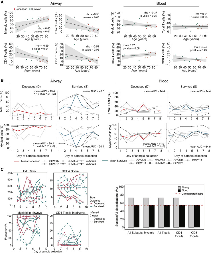
Figure 2.
Longitudinal assessments of immune cell composition and association with age and outcome
(A) Correlation of immune cell frequencies in the airways (left) and blood (right) with age. Each dot represents the mean immune cell frequency for each patient from all time points, and color denotes patient outcome: survived (blue), deceased (red). Statistical significance was calculated by Spearman correlation (indicated by ρ), with p value shown in each graph.
(B) Daily frequencies of immune cells in the airways (left) and blood (right) for each patient over time stratified by deceased and survived. Solid red and blue lines show mean cell lineage frequency for deceased and survived patients, respectively. Area under the curve (AUC) normalized for number of sampling days was calculated for each patient, and mean AUC is shown in each graph. Statistical significance was calculated by 1-tailed Mann-Whitney U tests (see Method details) for the AUC with Benjamini-Hochberg correction for multiple comparisons and is denoted by ∗p ≤ 0.05.
(C) k-means trajectory clustering analysis of clinical and immune cell frequencies with outcome. Left: representative trajectories of P:F ratio, SOFA score, airway myeloid cells, and airway CD4+ T cells for all patients used for k-means clustering and classification. The true outcome of each patient is denoted by red (deceased) or blue (survived) lines, and inferred clustering by k-means is denoted by solid (deceased) or dashed (survived) lines. Correct clustering denoted by red solid lines and blue dashed lines. Right: patient outcome classification performance of longitudinal k-means clustering for different combinations of immune cell trajectories and clinical parameters (SOFA score and P:F ratio). The percentage of patient outcomes successfully classified as deceased or survived is shown for each parameter measured in airways (gray) or blood (black). Dotted red line indicates classification performance by the P:F ratio and SOFA score.

