Figure 4.
Dysregulated myeloid cell subsets in the blood and airways of COVID-19 patients
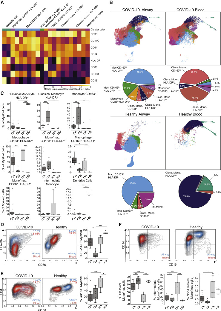
(A) Heatmap displaying expression of markers within PhenoGraph-generated, hierarchical myeloid cell clusters. A total of 21 PhenoGraph clusters were collapsed into 9 definable subsets indicated above the heatmap. Heatmap data are colored by value normalized to that of T cell expression as an internal negative control for each sample.
(B) UMAP embedding of 9 myeloid cell subsets in the airways (left) and blood (right) of COVID-19 (top) and healthy controls (bottom), with colors denoting the specific subset as defined in (A) (first and third rows). Pie charts indicating relative proportions of defined myeloid cell subsets in the airways and blood of COVID-19 patients and healthy controls (second and fourth rows).
(C) Boxplots showing compiled frequency of each myeloid subset displayed as an average of all time points collected for COVID-19 samples (CA, COVID-19 airway; CB, COVID-19 blood; HA, healthy airway; HB, healthy blood).
(D–F) Expression of myeloid markers in airways and blood shown as contour plots of expression of indicated markers by myeloid cells in airway (blue contours) and blood (red contours) samples by condition (healthy or COVID-19). Boxplots (to the right or below the contour plots) indicate the percentage of cells within each condition and site that were positive for specific markers. Statistical significance was calculated using a 1-way ANOVA followed by a Tukey HSD and indicated by ∗p ≤ 0.05; ∗∗p ≤ 0.01; and ∗∗∗p ≤ 0.001.

