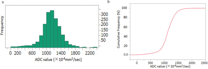
Fig. 4.
The method used to obtain percentile ADC values from histogram analysis. The ADC histogram is plotted with ADC values on the x-axis and the number of voxels on the y-axis (a). The curved line in red represents the relative cumulative frequency of voxels (i.e., the percentage of the number of cumulative voxels at each ADC value of the total number of voxels analyzed). The ADC values of the 10th, 25th, 50th, 75th, and 90th percentiles were obtained from the curve.

