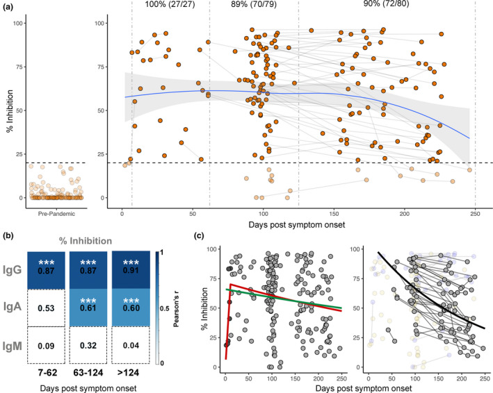
Figure 3.

Longitudinal neutralising antibodies. (a) Neutralising capacity (in % inhibition) of samples from days since symptom onset. Left panel shows responses in pre‐pandemic controls (n = 113), and right panel shows responses in PCR‐confirmed COVID‐19 patient samples (n = 189) over time. Pre‐pandemic samples were all below the 20% cut‐off indicated by dashed horizontal line. Paired samples are joined by grey lines. Dashed vertical lines represent the three time groups (7–62 days, 63–124 days and 125–250 days). LOESS regression (blue line) was used to visualise general trend in neutralising antibody levels, and standard error of regression is indicated by grey shaded area. Percent and number of samples from PCR‐confirmed cases above 20% inhibition cut‐off are indicated above the respective time points. (b) Pearson's correlation between % inhibition vs RBD IgG, IgA and IgM across three time groups. Non‐significant correlations are coloured white. Significant correlations are coloured in blue relative to their Pearson's r value. P‐values are corrected for multiple comparisons using the Bonferroni method, ***P < 0.001. (c). Visualisation of three modelling methods applied to predict half‐life of neutralising antibodies. Left panel shows the ‘exponential decay’ (green line) and ‘growth and decay’ (red line) models, which use all samples to model decay. In the ‘growth and decay’ model, samples up to 11 days (dark grey points) are used to model the growth phase, and samples over 11 days (light grey) are used to model exponential decay. Right panel shows the ‘individual decay’ model (black line) in which only samples with multiple paired measurements who were in the decay stage were utilised (grey points). Samples with only one measurement (yellow faded points) or those showing increased inhibition over time (blue faded points) were excluded.
