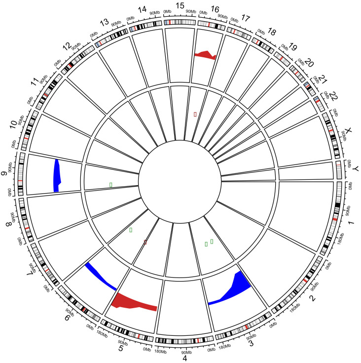
Figure 2.
Circos Plot showing the correlation of CNAs and gene expression from Oncomine data. The periphery circle represents regions of Copy Number Aberrations along the genome per chromosome. Red represents copy number gains and blue copy number losses. The inner circle contains genes with concomitant alteration in gene expression. Green dots represents down-regulated genes and red up-regulated genes.

