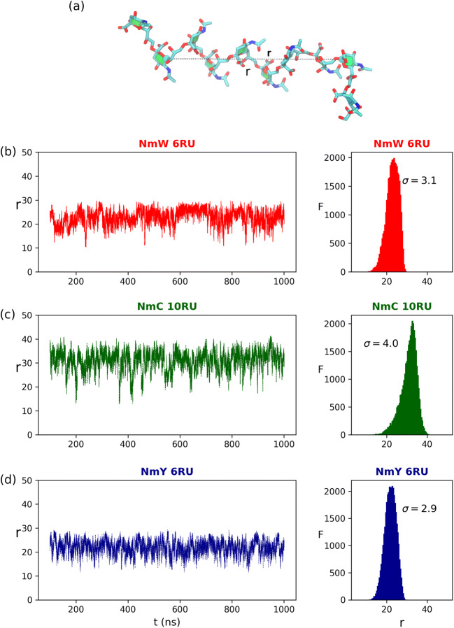
Fig. 1.
Comparison of the end-to-end distance (r) time series and distribution for the three meningococcal vaccine antigens, excluding the first 100 ns of each simulation. a A model of the 10 RU NmC chain with r shown. The line graphs of the r time series (left column) and the corresponding histograms (right column) are shown in order of decreasing saccharide loading in the conjugates: (b, red lines) NmW, (c, green lines) NmC and (d, blue lines) NmY. F is the frequency of each value of r

