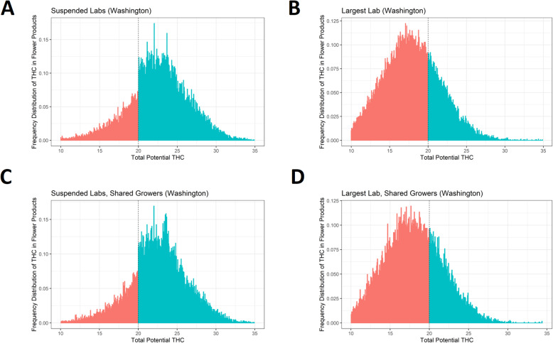
Fig. 2.
Frequency of reported THC content around the 20% threshold among subsets of labs. This figure consists of four plots showing histograms of the frequency of reported THC, with bins to the left of the 20% threshold shaded red and bins to the right of the 20% threshold shaded blue. Plots are left-truncated at 10% for presentational purposes. The top left plot (panel a) shows data from two labs in Washington state which had their licenses suspended (“suspended labs”), and the top right plot (panel b) shows data from the lab in Washington which tested the most products during the study period (“largest lab”). The bottom row also plots histograms from the suspended labs (left; panel c) and the largest lab (right; panel d) but only using testing data from those growers which sent products to both sets of labs. While the two suspended labs show sharp increases in frequency at the 20% threshold (panels a and c), the frequency distribution for the largest lab is smooth across the 20% THC threshold (panels b and d). Histogram bins were generated via the DCdensity function

