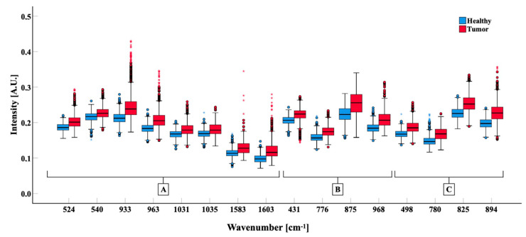
Figure 4.
Comparison of the band intensities of Healthy (blue) and Tumor (red) biopsies grouped for biological significance. Box-plots show 25°, 50°, 75° percentiles (box) and 5°–95° (whiskers) percentile of data distribution; the median of groups is indicated with a black bar. Mann–Whitney test was calculated for all bands showed (p < 0.001). (A) bands related to protein. (B) bands related to lipids. (C) Bands related to nucleic acids.

