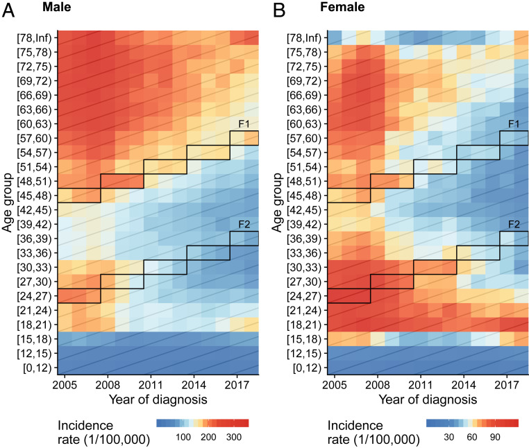
Fig. 2.
Active PTB incidence rate by year of diagnosis and age group at diagnosis among (A) men and (B) women. Colors represent the incidence rate, with red representing higher incidence rates and blue representing lower (note the differing scales in A and B). Each row represents the incidence rate across calendar years for that age group; each column represents the incidence rate across age groups for that year; and each diagonal line represents the change in incidence rate for that birth cohort as they age. The boxes outline the famine birth cohort (F1) and their likely offspring (F2). See definitions of F1 and F2 in Materials and Methods.

