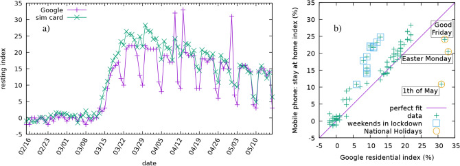
Figure 5.
Comparison of two methods for measuring the relative change from the baseline of "staying-at-home". Left (a) The residential index of Google (purple) and the CDR based stay-at-home index (green) plotted as a time series. Right (b) Scatter plot of the daily stay-at-home index as a function of the daily residential index of Google. Perfect fit would correspond to a set of points falling onto the diagonal line shown in purple. The weekends during the curfew seem to deviate from this to the left, whereas outliers to the right are corresponding to the national holidays.

