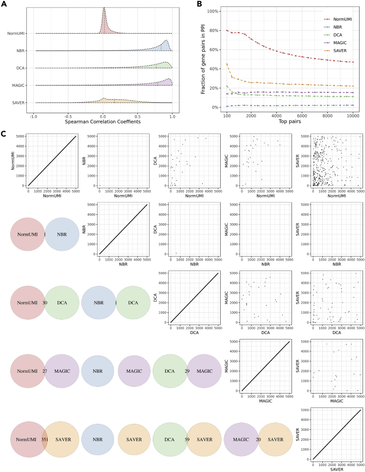
Figure 2.
Spurious gene-gene correlations are introduced during data preprocessing
(A) The distributions of the calculated correlations varied by preprocessing methods. NormUMI had a distribution centered close to zero, while NBR, DCA, and MAGIC all had apparently inflated correlation distributions. Vertical dotted lines indicate correlation medians.
(B) Enrichment curves of the top correlated gene pairs in PPI for each method. x axis indicates the top n gene pairs ranked by Spearman correlation coefficients; y axis indicates the fraction of the n gene pairs appearing in the STRING PPI database. NormUMI had the highest enrichment, followed by SAVER, MAGIC, DCA, and NBR.
(C) There was low consistency between the methods in inferring highly correlated gene pairs. Lower triangle indicates the overlapping of the top 5,000 gene pairs between the two denoted methods. The largest overlap was between NormUMI and SAVER, which has only 351 (∼7%) gene pairs ranked in the top 5,000 in both methods. Upper triangle compares the exact rank of the shared gene pairs between methods, which also shows low levels of agreement.

