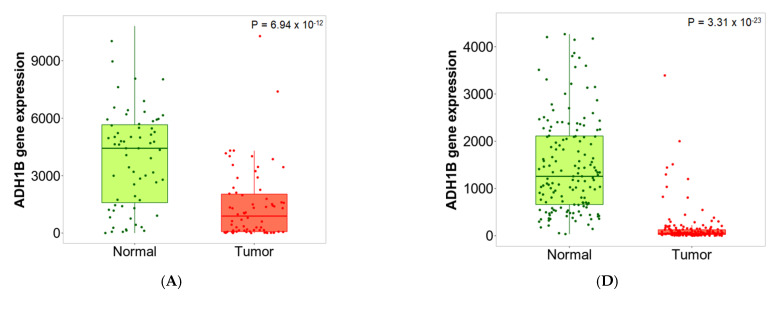
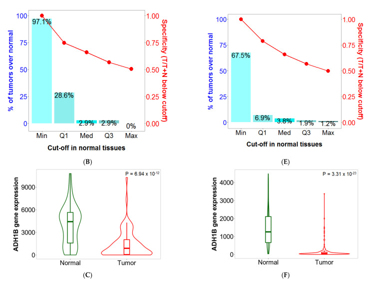
Figure 3.
Boxplots (A,D), bar charts (B,E) and violin plots (C,F) of ADH1B gene expression in breast (left) and colon cancer (right) when comparing paired normal and tumor gene array data. The bars represent the proportions of tumor samples that show higher expression of the selected gene compared to normal samples at each of the quantile cutoff values (minimum, 1st quartile, median, 3rd quartile, maximum). Specificity is calculated by dividing the number of tumor samples with the sum of tumor and normal samples below each given cutoff. In cases where the fold change was over 1, those “over” were used instead of those “below”.


