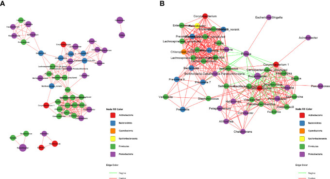
Figure 2.
Correction network analysis of 50 most abundant genera in (A) normal rats and (B) ECD rats. The lines between nodes represent Spearman correction, and color intensity represents correlation coefficient. The red line means positive correlation and the green line means negative correlation. The color of the genus is based on the subordination of the gate, and the size shows the average relative abundance.

