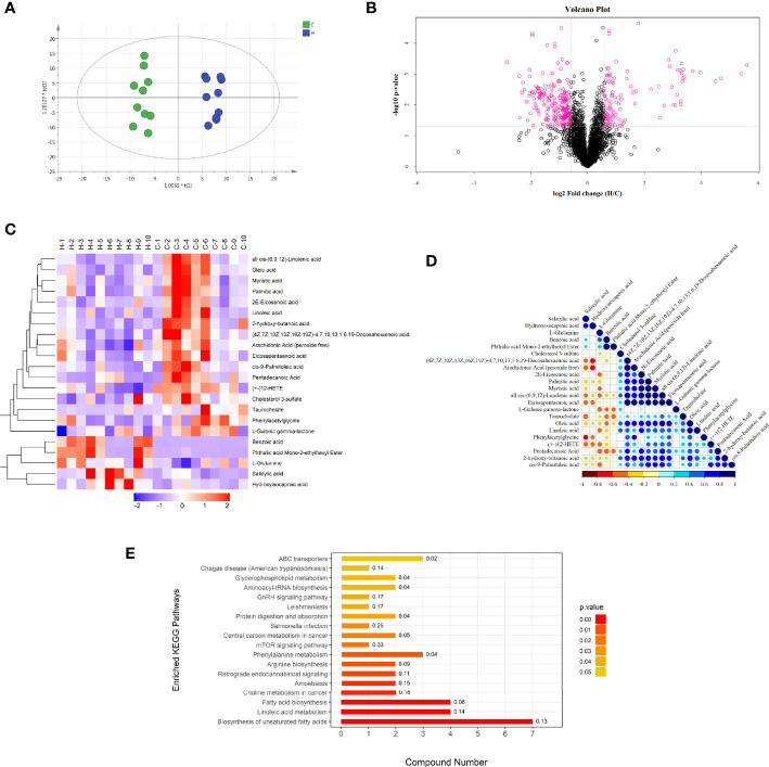
Figure 3.
Negative ion mode multivariate statistical analysis, heat map, cluster analysis, and metabolic pathway. (A) OPLS-DA score chart of serum metabolite analysis between the C and H groups. t [1] is the predicted principal component to distinguish the variation between groups, and the orthogonal principal component t0 [1] reflects the variation within the group. (B) volcano map of differential metabolites between the C and H groups. The red spots in the map show metabolites with FC >1.5 and P value < 0.05. These metabolites were screened by univariate statistical analysis. (C) Results of hierarchical clustering of metabolites with apparent changes in serum samples. Red and blue represent higher and lower concentrations of metabolites, respectively (FC >1.5 and P value < 0.05). (D) correlation of metabolites with significant differences between the two groups. (E) Results of the KEGG pathway enrichment analysis of differential metabolites (P < 0.05). The X axis represents the number of significantly different metabolites were enriched in this pathway, and the value on the histogram is richFactor.

