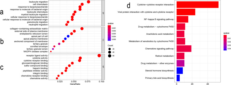
Fig. 2.
Bubble diagram results of GO analysis and histogram results of KEGG pathway analysis. Bubble diagram: The abscissa axis represents gene ratio while the ordinate axis represents term names. The size of a single bubble represents the degree of enrichment; the color variety represents different q value (those with red color are considered to be of significance). Histogram: The abscissa axis represents counts; the ordinate axis represents KEGG pathways; color represents the same meaning as the bubble diagram. a Top 10 enriched GO terms in biological process (BP); b top 10 enriched GO terms in cellular component (CC); c top 10 enriched GO terms in the molecular function (MF); d top 11 of enriched KEGG pathways

