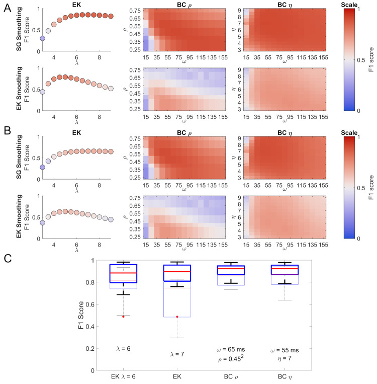
Figure 5.
Comparison of the EK and the BC methods using the F1 score. Panels A and B show the F1 scores as a function of different parameter combinations for the three methods (EK:λ; BCη: ω and η; BCρ: ω and ρ), for this data smoothed using the Savitzky-Golay filter are shown above and data smoothed using the EK method are shown below. The colour map chosen is a perceptual colour map distributed by Kovesi (2015) under the name CET-D1. Panel A shows the F1 scores, ignoring MEs and SEs, while panel B shows the F1 scores when MEs are counted as FNs and SEs as FPs. The box plots in panel C show the spread of F1 scores for the 9 participants for Savitzky-Golay smoothing (5 from the Oxford dataset and 4 from the Lund dataset). For box plots the edges of the box represent the 25th and 75th percentiles, the line in the centre represents the median, while the errorbars show the most extreme values not considered outliers. Outliers are plotted as separate red plus symbols. The thinly-lined box plots represent the same parameter combinations but compared to a ground truth including both binocular and monocular microsaccades. Below the box plots the parameters used are given. They represent the optimal parameters across all participants, apart from the EK λ = 6, which is given for context, as λ = 6 is often a suggested starting value.

