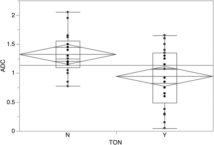
Fig 3.
Graph comparing the ADC (10−3 mm2/s) values and the clinical diagnosis of TON. Box-and-whisker plots with lines representing medians, interquartile ranges, and greatest and least values. Mean diamond plots with horizontal lines represent mean and upper and lower 95% confidence points for each group.

