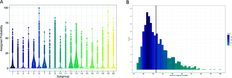
Fig. 4.
Distribution of subgroups across the study population. a Violin plot showing the probability per subgroup among the study population. Each violin displays the distribution of that subgroup across all participants. The median and interquartile range for each subgroup is represented by a white dot and bar. b Histogram showing the maximum probability for any subgroup per participant. The mean maximum probability was 33.24% ± 1.27% (indicated by vertical line). Each bin represents the participant count for that probability range. The darker the bin color, the higher the count

