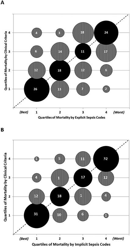
Figure 4. Concordance of hospital sepsis mortality rates when ranked into quartiles by A) explicit sepsis codes and B) implicit sepsis codes versus clinical criteria.

Bubble sizes are proportional to the number of hospitals in each matched quartile. The actual number of hospitals in each category is denoted within the bubbles.
The dotted line indicates where all hospitals / bubbles would lie if concordance was perfect between claims and clinical definitions.
Lower quartiles indicate better performance (i.e., quartile 1 = lowest sepsis mortality, quartile 4 = highest sepsis mortality).
Black bubbles = mortality quartiles that match between clinical criteria versus claims data.
Grey bubbles above the dotted line = quartiles that are worse by clinical criteria versus claims data. Grey bubbles below the dotted line = quartiles that are better by clinical criteria versus claims data.
