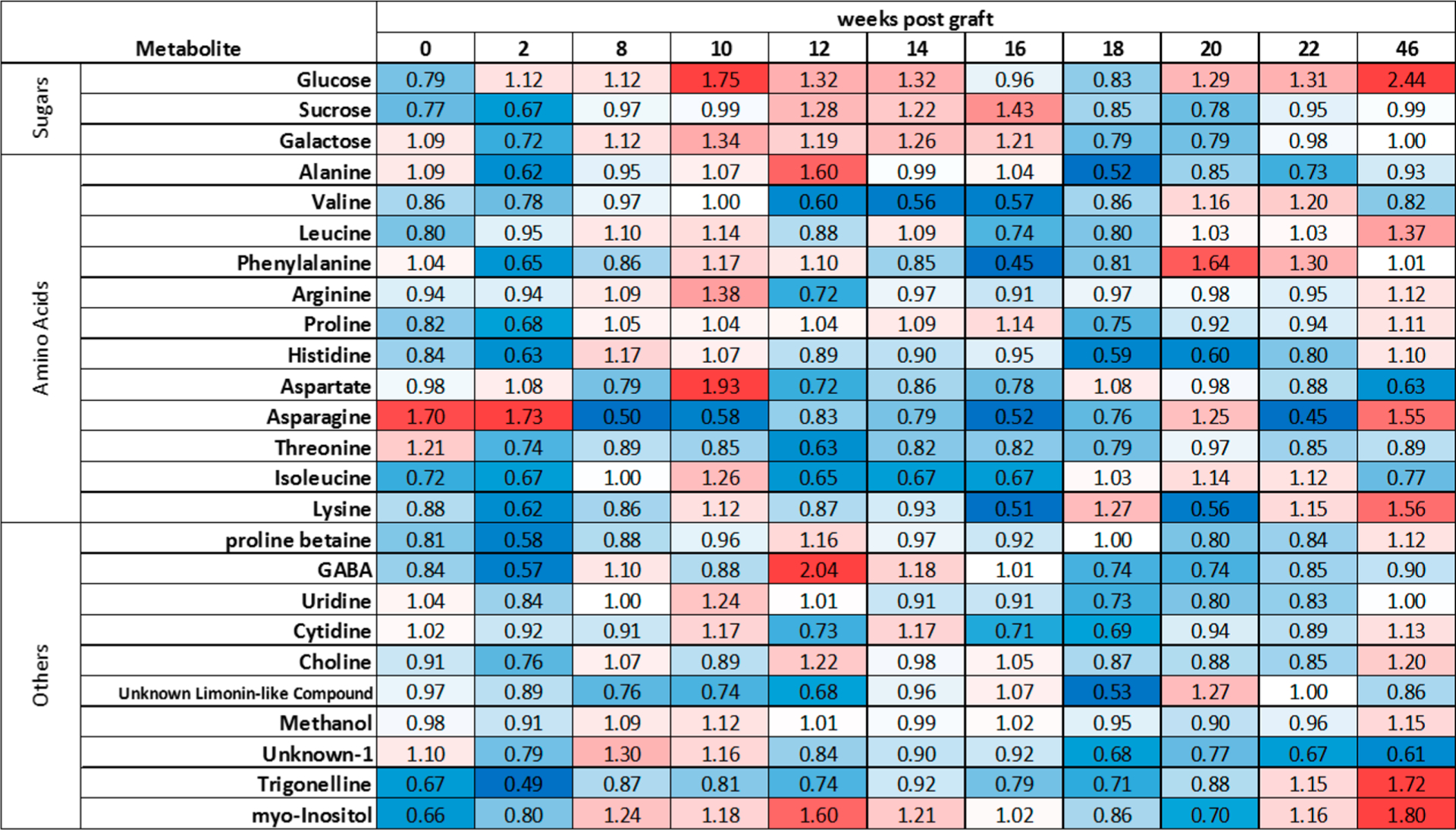
Figure 5.

Visual depiction of metabolite data. Median fold change of the average metabolite concentrations (infected relative to control) at each time point weeks post graft. Red indicates a higher median concentration in the infected plants, blue indicates a higher concentration in the control plants, white indicates equal concentration between conditions. More intense colors indicate a larger magnitude of difference.
