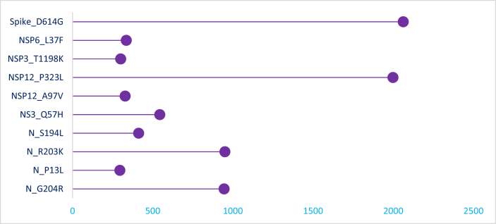
Figure 1.
Lollipop plots showing mutations distribution and frequency in Indian SARS-CoV-2 genome sequences. The frequency of mutations is shown on the X-axis and the presence of a mutation is shown on the Y axis (lollipop), correlates with the heights of the vertical lines representing each lollipop.

