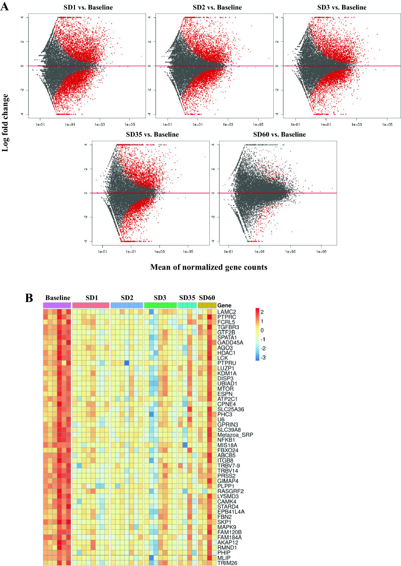
Figure 2.
(A) MA plot showing differences in gene expression between irradiated and baseline samples at different time points post-irradiation. The red dots indicate significantly changed genes and grey dots indicate non-significant genes. The X-axis represents mean of normalized gene counts and the Y-axis represents the Log transformed fold change. (B) Heat map showing top 50 genes expression across baseline, SD1 (day 1 post-irradiation), SD2 (day 2), SD3 (day 3), SD35 (day 35), SD60 (day 60). Heat map is created by open
source software R (version 4.0.3, https://cran.r-project.org/).

