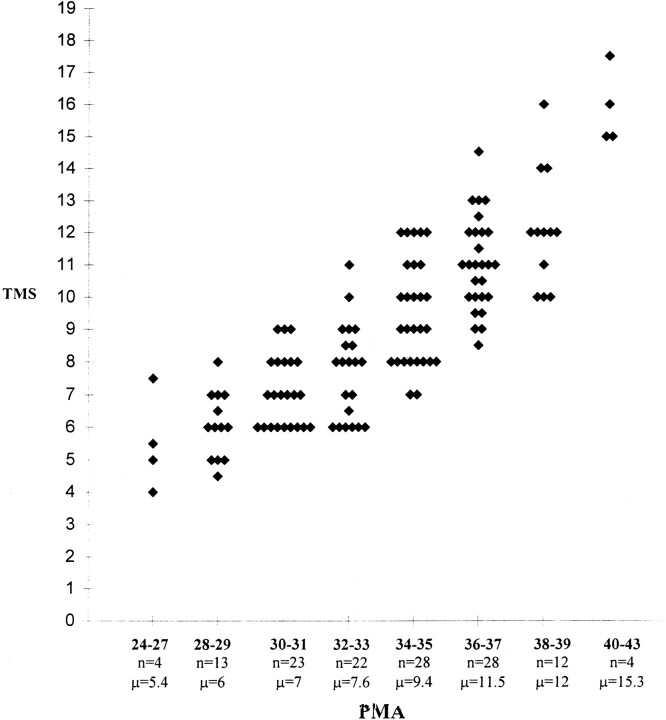
fig 6.
Graph shows different TMSs for different PMA groups. The graph has been plotted so that each infant is identifiable as a single point. Key to x-axis: numbers in boldface type = PMA (in weeks) of infants within each group; n = total number of infants in each group; μ = mean TMS for each age group

