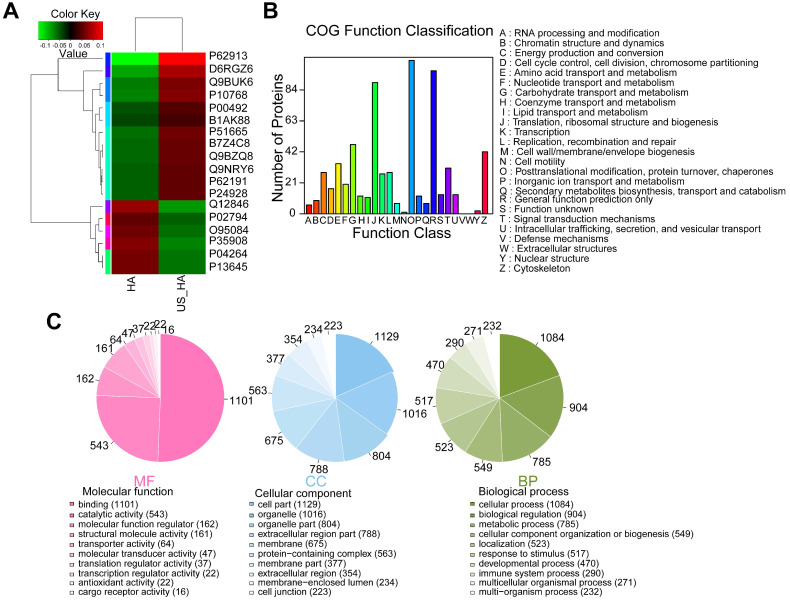
Figure 6.
Comparative proteomic analysis of HA-Exo with US-HA-Exo. (A) Heatmap of HA-Exo- vs US-HA-Exo-regulated proteins. Each column represents a sample, and each row represents a protein. The colors in the diagram represent the relative expression of the protein in the group. Red represents a higher protein expression level in the sample, and the green represents a lower expression level. (B) Cluster of Orthologous Groups (COG) function classification. (C) Each pie chart has a different color representing a different GO Term, and its area represents the relative proportion of protein in the GO Term. The chart contains three pie charts; three rows from left to right represent three branches of GO, MF (molecular function, pink), CC (cell component, blue), and BP (biological process, green); each row is illustrated below with the corresponding GO classification term.

