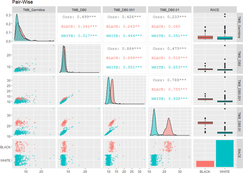
Fig. 2. Pair-wise visualization of the differences in tumor mutational burdens between race and variant filtering criteria.
This is a 5 × 5 matrix of pair-wise comparison. Red colors are data from Black patients, and blue colors are data from White patients. (1) The diagonal: density plots showing the increased separation of TMB distributions while relaxing the non-somatic variant filtering thresholds from paired germline (TMB_Germline), to ascending variant MAFs in 1000G and ExAC (TMB_DB0: MAF = 0; TMB_DB0.001: MAF ≤ 0.1%; TMB_DB0.01: MAF ≤ 1%). The last diagonal plot (bottom right) is the bar plot of the counts of 126 Black and 575 White patients included in the analyses. (2) The upper right panels of correlation values: the Pearson Correlation r values of TMBs across patients. The black numbers are the r values of all 701 patients. The last columns of the upper right panels are the box plots of the TMBs from different filtering criteria. (3) The lower left panels of dot plots illustrate the individual TMB values per patient; and the last row of the lower left panels are the jittered-point bar plots of individual TMB values.

