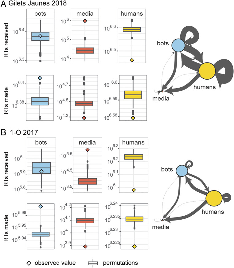
Fig. 4.
Centrality in the RT network. Panel A shows the network built with the Yellow Vests data; panel B shows the network built with the Catalan Referendum data. The boxplots summarize the values obtained from permutations of the data where the category labels were randomly reshuffled across accounts. The observed centrality of media accounts is significantly higher than expected by chance in both mobilizations. Human accounts, on the other hand, receive significantly fewer RTs. The axes preserve different scales to allow visual identification of distance between permutations and observed values. Regression models predicting centrality can be found in SI Appendix, Figs. S6 and S7.

