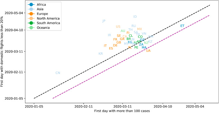
Fig. 9.
Scatter plots for the day of the first 100 reported cases versus the first day with more than 80% reductions in the number of domestic flights for different countries. Countries from different geographical locations are denoted with different colors. The black dashed diagonal line represents a perfect correlation between the occurrence of these two events; while the purple dashed diagonal line represents a 14-day pre-emptive flight reduction reference. Only data for countries with more than 10 domestic flights per day are shown; 42 countries matched the selection criterion. (For interpretation of the references to color in this figure legend, the reader is referred to the Web version of this article.)

