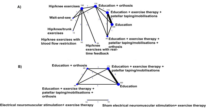
Figure 2.
Network graphs for direct treatment comparisons for any improvement at 3 months (A) and 12 months (B). Blue text represents the number of treatment comparisons, and the text in black represents the number of participant that received the respective treatment. The thickness of the lines and the size of the dots are proportional to the number of trial comparisons and the number of participants in the treatment arms, respectively.

