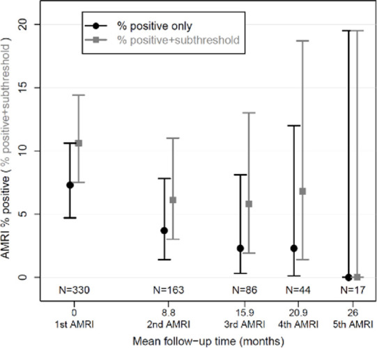
Figure 5b:

Surveillance results. (a) Boxplot shows surveillance interval data from the 163 patients who underwent at least one surveillance gadoxetate-enhanced abbreviated MRI (AMRI) after the baseline examination. The box plots show the median (solid horizontal bar), second and third quartile (solid box), and standard deviation (error bars) of the follow-up intervals between examinations for a given round of surveillance. The width of the plot is proportional to the number of studies in a given group, which is also listed at the bottom of the graph. Light gray represents the total interval from baseline examination, and dark gray represents the mean interval from the prior examination. (b) Graphic representation of the rate of positive examinations (black circles) or positive-plus-subthreshold examinations (gray squares) during a given round of gadoxetate-enhanced abbreviated MRI surveillance. The y-axis represents the percentage of studies in a group that were positive ± subthreshold. The x-axis represents the mean number of months between the first (baseline) examination and each subsequent round of surveillance. The number of studies in a given group is listed along the lower portion of the graph. There were 330 patients in the cohort who underwent a baseline (first) gadoxetate-enhanced abbreviated MRI examination, 163 who underwent a second examination, and so on. Error bars = lower and upper bounds of the 95% confidence interval.
