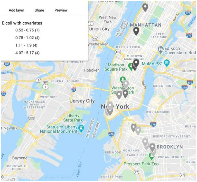
Figure 7.
Map of New York City generated from latitude and longitude of the samples from CSD16 sampling day using Google Maps. Color represents the estimated relative risk from the model for E. coli with area population and density as covariates. Darker color shows higher relative risk areas compared to the median across all samples in the city for CSD16. Most of the high risk areas are in Manhattan where density of the population is higher. Area density has a significant effect in the model.

