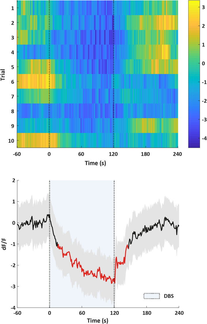
Figure 6.

Fiber photometry data (n = 1). The top figure shows a heatmap of the change in fluorescence (dF/F) before, during (between the dotted lines), and after DBS. Each row plots one DBS trial (total of 10). Color scale at the right indicates dF/F (yellow = high and dark blue = low dF/F). The bottom figure shows the change in fluorescence averaged over the ten trials of the same animal. Thick black line indicates mean, shaded areas indicate SEM, and red segments indicate statistically significant decrease from baseline (p < 0.05; permutation test). [Color figure can be viewed at wileyonlinelibrary.com]
