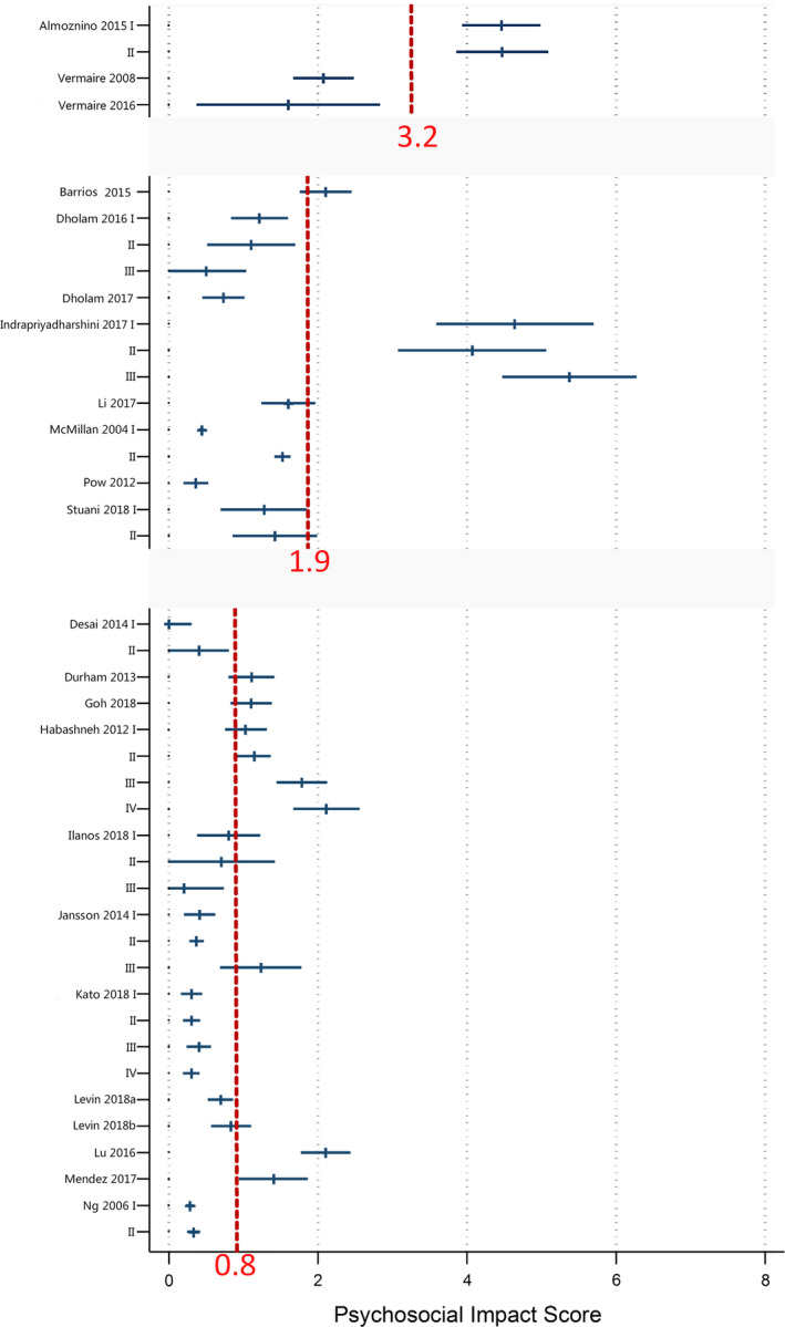
FIGURE 3.

Forest plots for the mean scores of included patient samples in the Psychosocial Impact dimension based on different disease disorders. The red dotted lines represent the pooled mean scores (weighted by sample size) of each disease disorder
