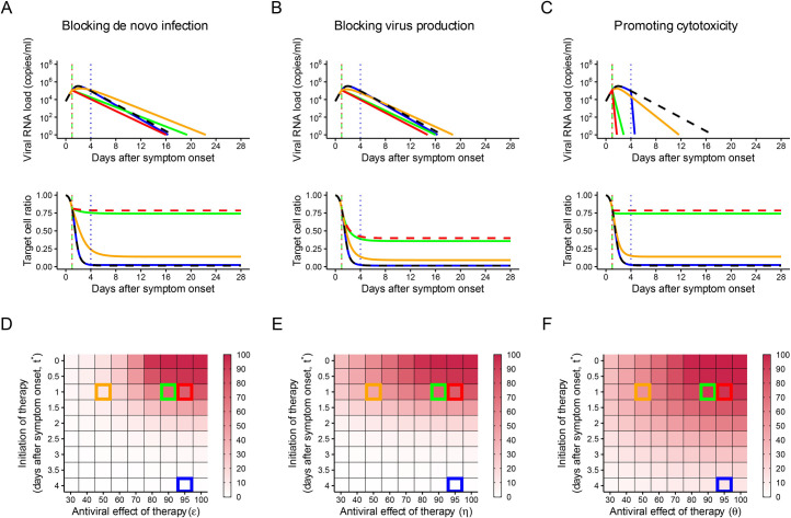
Fig 2. Predicted outcomes under anti-SARS-CoV-2 monotherapies.
(A–C) Expected viral load and uninfected target cell proportion trajectories with and without treatment for the 3 different treatments. The black curves are without treatment. The blue curves are with treatment (efficacy is 95%) initiated at 4 days after symptom onset. The red, green, and orange curves are with treatment initiated at 1 day after symptom onset, but with different efficacy (95%, 90%, and 50%, respectively). The dotted vertical lines correspond to the timing of treatment initiation. (D–F) The heatmap shows the reduction in the viral load area under the curve (AUC) with treatment compared to without treatment. The timing of treatment initiation and treatment efficacy were varied. Darker colors indicate a larger reduction in the viral load AUC. The parameter setting used for the simulation in (A–C) is indicated by the same-colored squares in (D–F). The data underlying this figure are given in S2 Data.

